サイトで使える!CSSで描くジブリキャラクターのパーツ
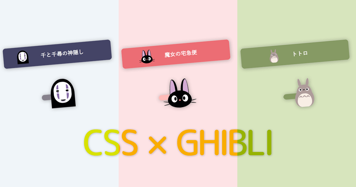
HTMLとCSSでジブリ風のボタンやスイッチを作ってみました。
ちなみに私が一番好きなジブリ作品は「ナウシカ」と「紅の豚」
一番好きなキャラクターは「ジジ」です。
それではいきます。
目次
ジジ
まずは魔女の宅急便から、キキの相棒の黒猫。
CSSで描いたジジ。可愛い。
「ジジ」のソースコードを開く
HTML
<b class="jiji_wra"><b class="jiji"><b class="ear"></b><b class="ear r"></b><b class="eye"></b><b class="eye r"></b><b class="hair"></b><b class="hair r"></b></b></b>CSS
/* エリア定義 */
.jiji_wra {
	display: block;
	position: relative;
	width: 100px; /* ジジを大きくする場合は、この値を大きく */
	z-index: 1;
}
/* エリア定義 */
.jiji_wra .jiji {
	display: block;
	width: 100%;
	padding: 120% 0 0;
}
/* 可愛い輪郭 */
.jiji_wra .jiji::before {
	content: "";
	position: absolute;
	left: 0;
	bottom: 0;
	width: 100%;
	height: 60%;
	border-radius: 50% 50% 50% 50% / 56% 56% 44% 44%;
	background: #020304;
	z-index: 3;
}
/* 可愛い鼻 */
.jiji_wra .jiji::after {
	content: "";
	position: absolute;
	left: 46%;
	bottom: 24%;
	width: 8%;
	height: 5%;
	border-radius: 50%;
	background: #EF8483;
	z-index: 4;
}
/* 可愛い耳 */
.jiji_wra .ear {
	position: absolute;
	top: 0;
	left: 10%;
	width: 34%;
	height: 60%;
	border-radius: 38% 62% 50% 50% / 100% 76% 24% 0%;
	background: #020304;
	box-sizing: border-box;
	z-index: 1;
}
.jiji_wra .ear::before {
	content: "";
	position: absolute;
	top: 4%;
	left: 6%;
	width: 67%;
	height: 98%;
	border-radius: 45% 55% 50% 50% / 100% 76% 24% 0%;
	background: #D4ABD4;
	z-index: 2;
}
.jiji_wra .ear.r {
	left: auto;
	right: 10%;
	transform: scaleX(-1);
}
/* 可愛い目 */
.jiji_wra .eye {
	position: absolute;
	bottom: 20%;
	left: 15%;
	width: 24%;
	height: 24%;
	border-radius: 50% 50% 50% 50% / 50% 58% 42% 50%;
	background: #fff;
	transition: transform 0.3s;
	z-index: 4;
}
.jiji_wra .eye::before {
	content: "";
	position: absolute;
	right: 10%;
	top: 25%;
	height: 50%;
	width: 40%;
	border-radius: 50%;
	background: #020304;
}
.jiji_wra .eye.r {
	left: auto;
	right: 15%;
	transform: scaleX(-1);
}
.jiji_btn a:hover .jiji_wra .eye {
	transform: scaleY(0);
}
.jiji_btn a:hover .jiji_wra .eye.r {
	transform: scale(-1, 0);
}
/* 可愛いヒゲ */
.jiji_wra .hair {
	position: absolute;
	right: 90%;
	bottom: 20%;
	width: 30%;
	height: 2%;
}
.jiji_wra .hair::before,
.jiji_wra .hair::after {
	content: "";
	position: absolute;
	top: 0;
	right: 0;
	width: 100%;
	height: 100%;
	border-radius: 50%;
	background: #020304;
	transform-origin: 100% 50%;
	transform: rotate(10deg);
	z-index: -2;
}
.jiji_wra .hair::after {
	top: 240%;
	width: 94%;
	transform: rotate(-10deg);
}
.jiji_wra .hair.r {
	right: auto;
	left: 90%;
	transform: scaleX(-1);
}
ジジのボタン。 可愛い。
「ジジのボタン」のソースコードを開く
HTML
<p class="jiji_btn"><a href="#jiji"><span><b class="jiji_wra"><b class="jiji"><b class="ear"></b><b class="ear r"></b><b class="eye"></b><b class="eye r"></b><b class="hair"></b><b class="hair r"></b></b></b>魔女の宅急便</span></a></p>CSS
.jiji_btn a {
	display: inline-flex;
	justify-content: center;
	align-items: center;
	width: 100%;
	max-width: 320px;
	height: 60px;
	border-radius: 8px;
	font-weight: bold;
	color: #fff;
	background: #EC6D74;
	transition: background 0.3s;
	text-decoration: none;
}

.jiji_btn span {
	position: relative;
	padding: 0 40px 0 70px;
}
/* エリア定義 */
.jiji_wra {
	position: absolute;
	left: 0;
	top: 50%;
	transform: translateY(-50%);
	width: 33px; /* ジジを大きくする場合は、この値を大きく */
	z-index: 1;
}
/* エリア定義 */
.jiji_wra .jiji {
	display: block;
	width: 100%;
	padding: 120% 0 0;
}
/* 可愛い輪郭 */
.jiji_wra .jiji::before {
	content: "";
	position: absolute;
	left: 0;
	bottom: 0;
	width: 100%;
	height: 60%;
	border-radius: 50% 50% 50% 50% / 56% 56% 44% 44%;
	background: #020304;
	z-index: 3;
}
/* 可愛い鼻 */
.jiji_wra .jiji::after {
	content: "";
	position: absolute;
	left: 46%;
	bottom: 24%;
	width: 8%;
	height: 5%;
	border-radius: 50%;
	background: #EF8483;
	z-index: 4;
}
/* 可愛い耳 */
.jiji_wra .ear {
	position: absolute;
	top: 0;
	left: 10%;
	width: 34%;
	height: 60%;
	border-radius: 38% 62% 50% 50% / 100% 76% 24% 0%;
	background: #020304;
	box-sizing: border-box;
	z-index: 1;
}
.jiji_wra .ear::before {
	content: "";
	position: absolute;
	top: 4%;
	left: 6%;
	width: 67%;
	height: 98%;
	border-radius: 45% 55% 50% 50% / 100% 76% 24% 0%;
	background: #D4ABD4;
	z-index: 2;
}
.jiji_wra .ear.r {
	left: auto;
	right: 10%;
	transform: scaleX(-1);
}
/* 可愛い目 */
.jiji_wra .eye {
	position: absolute;
	bottom: 20%;
	left: 15%;
	width: 24%;
	height: 24%;
	border-radius: 50% 50% 50% 50% / 50% 58% 42% 50%;
	background: #fff;
	transition: transform 0.3s;
	z-index: 4;
}
.jiji_wra .eye::before {
	content: "";
	position: absolute;
	right: 10%;
	top: 25%;
	height: 50%;
	width: 40%;
	border-radius: 50%;
	background: #020304;
}
.jiji_wra .eye.r {
	left: auto;
	right: 15%;
	transform: scaleX(-1);
}
.jiji_btn a:hover .jiji_wra .eye {
	transform: scaleY(0);
}
.jiji_btn a:hover .jiji_wra .eye.r {
	transform: scale(-1, 0);
}
/* 可愛いヒゲ */
.jiji_wra .hair {
	position: absolute;
	right: 90%;
	bottom: 20%;
	width: 30%;
	height: 2%;
}
.jiji_wra .hair::before,
.jiji_wra .hair::after {
	content: "";
	position: absolute;
	top: 0;
	right: 0;
	width: 100%;
	height: 100%;
	border-radius: 50%;
	background: #020304;
	transform-origin: 100% 50%;
	transform: rotate(10deg);
	z-index: -2;
}
.jiji_wra .hair::after {
	top: 240%;
	width: 94%;
	transform: rotate(-10deg);
}
.jiji_wra .hair.r {
	right: auto;
	left: 90%;
	transform: scaleX(-1);
}
ジジのスイッチ(チェックボックス)。 可愛い。
「ジジのスイッチ」のソースコードを開く
HTML
<input id="jiji_check" type="checkbox" hidden>
<label for="jiji_check"><span><b class="jiji_wra"><b class="jiji"><b class="ear"></b><b class="ear r"></b><b class="eye"></b><b class="eye r"></b><b class="hair"></b><b class="hair r"></b></b></b></span></label>
CSS
label[for="jiji_check"] span {
	display: inline-block;
	position: relative;
	width: 50px;
	height: 10px;
	margin: 0 10px;
	border-radius: 5px;
	background: #ddd;
	cursor: pointer;
}
/* エリア定義 */
.jiji_wra {
	position: absolute;
	left: -10px;
	top: 50%;
	transform: translateY(-60%);
	width: 44px; /* ジジを大きくする場合は、この値を大きく */
	z-index: 1;
	transition: left 0.3s;
}
#jiji_check:checked + label[for="jiji_check"] .jiji_wra {
	left: calc(100% - 33px);
}
#jiji_check:checked + label[for="jiji_check"] span {
	background: #FFBBB8;
}
/* エリア定義 */
.jiji_wra .jiji {
	display: block;
	width: 100%;
	padding: 120% 0 0;
}
/* 可愛い輪郭 */
.jiji_wra .jiji::before {
	content: "";
	position: absolute;
	left: 0;
	bottom: 0;
	width: 100%;
	height: 60%;
	border-radius: 50% 50% 50% 50% / 56% 56% 44% 44%;
	background: #020304;
	z-index: 3;
}
/* 可愛い鼻 */
.jiji_wra .jiji::after {
	content: "";
	position: absolute;
	left: 46%;
	bottom: 24%;
	width: 8%;
	height: 5%;
	border-radius: 50%;
	background: #EF8483;
	z-index: 4;
}
/* 可愛い耳 */
.jiji_wra .ear {
	position: absolute;
	top: 0;
	left: 10%;
	width: 34%;
	height: 60%;
	border-radius: 38% 62% 50% 50% / 100% 76% 24% 0%;
	background: #020304;
	box-sizing: border-box;
	z-index: 1;
}
.jiji_wra .ear::before {
	content: "";
	position: absolute;
	top: 4%;
	left: 6%;
	width: 67%;
	height: 98%;
	border-radius: 45% 55% 50% 50% / 100% 76% 24% 0%;
	background: #D4ABD4;
	z-index: 2;
}
.jiji_wra .ear.r {
	left: auto;
	right: 10%;
	transform: scaleX(-1);
}
/* 可愛い目 */
.jiji_wra .eye {
	position: absolute;
	bottom: 20%;
	left: 15%;
	width: 24%;
	height: 24%;
	border-radius: 50% 50% 50% 50% / 50% 58% 42% 50%;
	background: #fff;
	transition: transform 0.3s;
	z-index: 4;
}
.jiji_wra .eye::before {
	content: "";
	position: absolute;
	right: 10%;
	top: 25%;
	height: 50%;
	width: 40%;
	border-radius: 50%;
	background: #020304;
}
.jiji_wra .eye.r {
	left: auto;
	right: 15%;
	transform: scaleX(-1);
}
#jiji_check:not(:checked) + label[for="jiji_check"] .jiji_wra .eye {
	transform: scaleY(0);
}
#jiji_check:not(:checked) + label[for="jiji_check"] .jiji_wra .eye.r {
	transform: scale(-1, 0);
}
/* 可愛いヒゲ */
.jiji_wra .hair {
	position: absolute;
	right: 90%;
	bottom: 20%;
	width: 30%;
	height: 2%;
}
.jiji_wra .hair::before,
.jiji_wra .hair::after {
	content: "";
	position: absolute;
	top: 0;
	right: 0;
	width: 100%;
	height: 100%;
	border-radius: 50%;
	background: #020304;
	transform-origin: 100% 50%;
	transform: rotate(10deg);
	z-index: -2;
}
.jiji_wra .hair::after {
	top: 240%;
	width: 94%;
	transform: rotate(-10deg);
}
.jiji_wra .hair.r {
	right: auto;
	left: 90%;
	transform: scaleX(-1);
}
カオナシ
CSSで描いた、カオナシ。
「カオナシ」のソースコードを開く
HTML
<b class="kaonashi_wra"><b class="kaonashi"><b class="make"></b><b class="make r"></b><b class="eye"></b><b class="eye r"></b><b class="mouth"></b></b></b>CSS
/* エリア定義 */
.kaonashi_wra {
	position: relative;
	display: block;
	width: 100px; /* カオナシを大きくする場合は、この値を大きく */
	z-index: 1;
}
/* エリア定義 */
.kaonashi_wra .kaonashi {
	display: block;
	width: 100%;
	padding: 120% 0 0;
}
/* 輪郭 */
.kaonashi_wra .kaonashi::before {
	content: "";
	position: absolute;
	left: 12%;
	top: 10%;
	width: 76%;
	height: 74%;
	border-radius: 48% 48% 48% 48% / 42% 42% 42% 42%;
	background: #fff;
	z-index: 2;
}
/* 体 */
.kaonashi_wra .kaonashi::after {
	content: "";
	position: absolute;
	top: 0;
	left: 0;
	width: 100%;
	height: 100%;
	border-radius: 48% 48% 47% 48% / 52% 52% 0% 0%;
	background: rgba(0,0,5,1);
	z-index: 1;
}
.kaonashi_wra .kaonashi .make {
	position: absolute;
	top: 20%;
	left: 25%;
	width: 50%;
	height: 50%;
	z-index: 2;
}
.kaonashi_wra .kaonashi .make::before,
.kaonashi_wra .kaonashi .make::after {
	content: "";
	position: absolute;
	top: 0;
	left: 0;
	width: 18%;
	height: 30%;
	border-radius: 100% 0% 0% 100% / 100% 100% 0% 0%;
	background: #866BA7;
}
.kaonashi_wra .kaonashi .make::after {
	top: auto;
	bottom: 0;
	height: 40%;
	transform: scaleY(-1);
}
.kaonashi_wra .kaonashi .make.r {
	transform: scaleX(-1);
}
.kaonashi_wra .kaonashi .eye {
	position: absolute;
	top: 20%;
	left: 24%;
	width: 52%;
	height: 50%;
	z-index: 2;
}
.kaonashi_wra .kaonashi .eye::before,
.kaonashi_wra .kaonashi .eye::after {
	content: "";
	position: absolute;
	top: 36%;
	left: 0;
	width: 22%;
	height: 12%;
	border-radius: 50%;
	background: #000;
}
.kaonashi_wra .kaonashi .eye::after {
	top: 51%;
	left: 2%;
	width: 18%;
	height: 5%;
	border-radius: 100% 0% 50% 50% / 0% 0% 100% 100%;
	background: #866BA7;
}
.kaonashi_wra .kaonashi .eye.r {
	transform: scaleX(-1);
}
.kaonashi_wra .kaonashi .mouth {
	position: absolute;
	bottom: 24%;
	left: 40%;
	width: 20%;
	height: 4%;
	border-radius: 100% 0% 50% 50% / 0% 0% 100% 100%;
	background: #000;
	z-index: 2;
}
.kaonashi_wra .kaonashi .mouth::before {
	content: "";
	position: absolute;
	top: 120%;
	left: 10%;
	width: 80%;
	height: 50%;
	border-radius: 100% 0% 50% 50% / 0% 0% 100% 100%;
	background: #866BA7;
}
カオナシのボタン。
「カオナシのボタン」のソースコードを開く
HTML
<p class="kaonashi_btn"><a href="#kaonashi"><span><b class="kaonashi_wra"><b class="kaonashi"><b class="make"></b><b class="make r"></b><b class="eye"></b><b class="eye r"></b><b class="mouth"></b></b></b>千と千尋の神隠し</span></a></p>CSS
.kaonashi_btn a {
	display: inline-flex;
	justify-content: center;
	align-items: center;
	width: 100%;
	max-width: 320px;
	height: 60px;
	border-radius: 8px;
	font-weight: bold;
	color: #fff;
	background: #444466;
	transition: background 0.3s;
	text-decoration: none;
}

.kaonashi_btn span {
	position: relative;
	padding: 0 40px 0 70px;
}
/* エリア定義 */
.kaonashi_wra {
	position: absolute;
	left: 0;
	top: 50%;
	transform: translateY(-50%);
	width: 33px; /* カオナシを大きくする場合は、この値を大きく */
	z-index: 1;
}
/* エリア定義 */
.kaonashi_wra .kaonashi {
	display: block;
	width: 100%;
	padding: 120% 0 0;
}
/* 輪郭 */
.kaonashi_wra .kaonashi::before {
	content: "";
	position: absolute;
	left: 12%;
	top: 10%;
	width: 76%;
	height: 74%;
	border-radius: 48% 48% 48% 48% / 42% 42% 42% 42%;
	background: #fff;
	z-index: 2;
}
/* 体 */
.kaonashi_wra .kaonashi::after {
	content: "";
	position: absolute;
	top: 0;
	left: 0;
	width: 100%;
	height: 100%;
	border-radius: 48% 48% 47% 48% / 52% 52% 0% 0%;
	background: rgba(0,0,5,1);
	z-index: 1;
}
.kaonashi_wra .kaonashi .make {
	position: absolute;
	top: 20%;
	left: 25%;
	width: 50%;
	height: 50%;
	z-index: 2;
}
.kaonashi_wra .kaonashi .make::before,
.kaonashi_wra .kaonashi .make::after {
	content: "";
	position: absolute;
	top: 0;
	left: 0;
	width: 18%;
	height: 30%;
	border-radius: 100% 0% 0% 100% / 100% 100% 0% 0%;
	background: #866BA7;
}
.kaonashi_wra .kaonashi .make::after {
	top: auto;
	bottom: 0;
	height: 40%;
	transform: scaleY(-1);
}
.kaonashi_wra .kaonashi .make.r {
	transform: scaleX(-1);
}
.kaonashi_wra .kaonashi .eye {
	position: absolute;
	top: 20%;
	left: 24%;
	width: 52%;
	height: 50%;
	z-index: 2;
}
.kaonashi_wra .kaonashi .eye::before,
.kaonashi_wra .kaonashi .eye::after {
	content: "";
	position: absolute;
	top: 36%;
	left: 0;
	width: 22%;
	height: 12%;
	border-radius: 50%;
	background: #000;
}
.kaonashi_wra .kaonashi .eye::after {
	top: 51%;
	left: 2%;
	width: 18%;
	height: 5%;
	border-radius: 100% 0% 50% 50% / 0% 0% 100% 100%;
	background: #866BA7;
}
.kaonashi_wra .kaonashi .eye.r {
	transform: scaleX(-1);
}
.kaonashi_wra .kaonashi .mouth {
	position: absolute;
	bottom: 24%;
	left: 40%;
	width: 20%;
	height: 4%;
	border-radius: 100% 0% 50% 50% / 0% 0% 100% 100%;
	background: #000;
	z-index: 2;
}
.kaonashi_wra .kaonashi .mouth::before {
	content: "";
	position: absolute;
	top: 120%;
	left: 10%;
	width: 80%;
	height: 50%;
	border-radius: 100% 0% 50% 50% / 0% 0% 100% 100%;
	background: #866BA7;
}
カオナシのスイッチ(チェックボックス)。
「カオナシのスイッチ」のソースコードを開く
HTML
<input id="kaonashi_check" type="checkbox" hidden>
<label for="kaonashi_check"><span><b class="kaonashi_wra"><b class="kaonashi"><b class="make"></b><b class="make r"></b><b class="eye"></b><b class="eye r"></b><b class="mouth"></b></b></b></span></label>
CSS
label[for="kaonashi_check"] span {
	display: inline-block;
	position: relative;
	width: 50px;
	height: 10px;
	margin: 0 10px;
	border-radius: 5px;
	background: #ddd;
	cursor: pointer;
}

label[for="kaonashi_check"] .kaonashi_wra {
	left: -10px;
	width: 44px;
	transform: translateY(-60%);
	transition: left 0.3s;
}
#kaonashi_check:checked + label[for="kaonashi_check"] .kaonashi_wra {
	left: calc(100% - 33px);
}
#kaonashi_check:checked + label[for="kaonashi_check"] span {
	background: #86808C;
}
/* エリア定義 */
.kaonashi_wra {
	position: absolute;
	left: 0;
	top: 50%;
	transform: translateY(-50%);
	width: 33px; /* カオナシを大きくする場合は、この値を大きく */
	z-index: 1;
}
/* エリア定義 */
.kaonashi_wra .kaonashi {
	display: block;
	width: 100%;
	padding: 120% 0 0;
}
/* 輪郭 */
.kaonashi_wra .kaonashi::before {
	content: "";
	position: absolute;
	left: 12%;
	top: 10%;
	width: 76%;
	height: 74%;
	border-radius: 48% 48% 48% 48% / 42% 42% 42% 42%;
	background: #fff;
	z-index: 2;
}
/* 体 */
.kaonashi_wra .kaonashi::after {
	content: "";
	position: absolute;
	top: 0;
	left: 0;
	width: 100%;
	height: 100%;
	border-radius: 48% 48% 47% 48% / 52% 52% 0% 0%;
	background: rgba(0,0,5,1);
	z-index: 1;
}
.kaonashi_wra .kaonashi .make {
	position: absolute;
	top: 20%;
	left: 25%;
	width: 50%;
	height: 50%;
	z-index: 2;
}
.kaonashi_wra .kaonashi .make::before,
.kaonashi_wra .kaonashi .make::after {
	content: "";
	position: absolute;
	top: 0;
	left: 0;
	width: 18%;
	height: 30%;
	border-radius: 100% 0% 0% 100% / 100% 100% 0% 0%;
	background: #866BA7;
}
.kaonashi_wra .kaonashi .make::after {
	top: auto;
	bottom: 0;
	height: 40%;
	transform: scaleY(-1);
}
.kaonashi_wra .kaonashi .make.r {
	transform: scaleX(-1);
}
.kaonashi_wra .kaonashi .eye {
	position: absolute;
	top: 20%;
	left: 24%;
	width: 52%;
	height: 50%;
	z-index: 2;
}
.kaonashi_wra .kaonashi .eye::before,
.kaonashi_wra .kaonashi .eye::after {
	content: "";
	position: absolute;
	top: 36%;
	left: 0;
	width: 22%;
	height: 12%;
	border-radius: 50%;
	background: #000;
}
.kaonashi_wra .kaonashi .eye::after {
	top: 51%;
	left: 2%;
	width: 18%;
	height: 5%;
	border-radius: 100% 0% 50% 50% / 0% 0% 100% 100%;
	background: #866BA7;
}
.kaonashi_wra .kaonashi .eye.r {
	transform: scaleX(-1);
}
.kaonashi_wra .kaonashi .mouth {
	position: absolute;
	bottom: 24%;
	left: 40%;
	width: 20%;
	height: 4%;
	border-radius: 100% 0% 50% 50% / 0% 0% 100% 100%;
	background: #000;
	z-index: 2;
}
.kaonashi_wra .kaonashi .mouth::before {
	content: "";
	position: absolute;
	top: 120%;
	left: 10%;
	width: 80%;
	height: 50%;
	border-radius: 100% 0% 50% 50% / 0% 0% 100% 100%;
	background: #866BA7;
}
トトロ
CSSで描いた、トトロ。
「トトロ」のソースコードを開く
HTML
<b class="totoro_wra"><b class="totoro"><b class="ear"></b><b class="eye"></b><b class="eye r"></b><b class="nose"></b><b class="shape"></b><b class="shape l"></b><b class="shape r"></b></b></b>CSS
/* エリア定義 */
.totoro_wra {
	position: relative;
	display: block;
	width: 100px; /* トトロを大きくする場合は、この値を大きく */
	z-index: 1;
}
/* エリア定義 */
.totoro_wra .totoro {
	display: block;
	width: 100%;
	padding: 120% 0 0;
}
/* 輪郭 */
.totoro_wra .totoro::before,
.totoro_wra .totoro::after {
	content: "";
	position: absolute;
	bottom: 0;
	left: 10%;
	width: 80%;
	height: 65%;
	border-radius: 50% 50% 35% 35% / 57% 57% 40% 40%;
	background: #AE9C9A;
	z-index: 2;
}
/* 輪郭 上 */
.totoro_wra .totoro::after {
	bottom: 8%;
	left: 17%;
	width: 66%;
	height: 70%;
	border-radius: 45% 45% 50% 50%;
}
/* 耳 */
.totoro_wra .ear {
	position: absolute;
	top: 0;
	left: 28%;
	width: 42%;
	height: 26.5%;
	z-index: 1;
}
.totoro_wra .ear::before,
.totoro_wra .ear::after {
	content: "";
	position: absolute;
	bottom: 0;
	left: 0;
	width: 30%;
	height: 100%;
	border-radius: 50% 50% 50% 50% / 78% 78% 22% 22%;
	background: #AE9C9A;
	transform-origin: 50% 100%;
	transform: rotate(-10deg);
}
.totoro_wra .ear::after {
	left: auto;
	right: 0;
	transform: rotate(10deg);
}
/* 目 */
.totoro_wra .eye {
	position: absolute;
	top: 35%;
	left: 28%;
	width: 42%;
	height: 10%;
	z-index: 3;
}
.totoro_wra .eye::before,
.totoro_wra .eye::after {
	content: "";
	position: absolute;
	top: 0;
	left: 0;
	width: 30%;
	height: 100%;
	border-radius: 50%;
	background: #fff;
}
.totoro_wra .eye::after {
	top: 17%;
	left: 9%;
	width: 17%;
	height: 60%;
	background: #3C2F2E;
}
.totoro_wra .eye.r {
	transform: scaleX(-1);
}
/* 鼻 */
.totoro_wra .nose::before {
	content: "";
	position: absolute;
	top: 39%;
	left: 45.5%;
	width: 8%;
	height: 3%;
	border-radius: 50%;
	background: #3C2F2E;
	z-index: 3;
}
/* お腹 */
.totoro_wra .nose::after {
	content: "";
	position: absolute;
	bottom: 0;
	left: 20%;
	width: 60%;
	height: 47%;
	border-radius: 45% 45% 35% 35% / 57% 57% 40% 40%;
	background: #F7EEE5;
	z-index: 3;
}
/* お腹の模様 */
.totoro_wra .shape {
	position: absolute;
	top: 60%;
	left: 48%;
	width: 4%;
	height: 8%;
	z-index: 3;
}
.totoro_wra .shape::before,
.totoro_wra .shape::after {
	content: "";
	position: absolute;
	top: 0;
	left: 0;
	width: 100%;
	height: 100%;
	border-radius: 50%;
	background: #AE9C9A;
	transform-origin: 50% 8%;
	transform: rotate(45deg);
	z-index: 1;
}
.totoro_wra .shape::after {
	transform: rotate(-45deg);
}
.totoro_wra .shape.l {
	top: 61%;
	left: 33%;
}
.totoro_wra .shape.r {
	top: 61%;
	left: 63%;
}
トトロのボタン。
「トトロのボタン」のソースコードを開く
HTML
<p class="totoro_btn"><a href="#kaonashi"><span><b class="totoro_wra"><b class="totoro"><b class="ear"></b><b class="eye"></b><b class="eye r"></b><b class="nose"></b><b class="shape"></b><b class="shape l"></b><b class="shape r"></b></b></b>となりのトトロ</span></a></p>CSS
.totoro_btn a {
	display: inline-flex;
	justify-content: center;
	align-items: center;
	width: 100%;
	max-width: 320px;
	height: 60px;
	border-radius: 8px;
	font-weight: bold;
	color: #fff;
	background: #869A64;
	transition: background 0.3s;
	text-decoration: none;
}

.totoro_btn span {
	position: relative;
	padding: 0 40px 0 70px;
}
/* エリア定義 */
.totoro_wra {
	position: absolute;
	left: 0;
	top: 50%;
	transform: translateY(-50%);
	width: 33px; /* トトロを大きくする場合は、この値を大きく */
	z-index: 1;
}
/* エリア定義 */
.totoro_wra .totoro {
	display: block;
	width: 100%;
	padding: 120% 0 0;
}
/* 輪郭 */
.totoro_wra .totoro::before,
.totoro_wra .totoro::after {
	content: "";
	position: absolute;
	bottom: 0;
	left: 10%;
	width: 80%;
	height: 65%;
	border-radius: 50% 50% 35% 35% / 57% 57% 40% 40%;
	background: #AE9C9A;
	z-index: 2;
}
/* 輪郭 上 */
.totoro_wra .totoro::after {
	bottom: 8%;
	left: 17%;
	width: 66%;
	height: 70%;
	border-radius: 45% 45% 50% 50%;
}
/* 耳 */
.totoro_wra .ear {
	position: absolute;
	top: 0;
	left: 28%;
	width: 42%;
	height: 26.5%;
	z-index: 1;
}
.totoro_wra .ear::before,
.totoro_wra .ear::after {
	content: "";
	position: absolute;
	bottom: 0;
	left: 0;
	width: 30%;
	height: 100%;
	border-radius: 50% 50% 50% 50% / 78% 78% 22% 22%;
	background: #AE9C9A;
	transform-origin: 50% 100%;
	transform: rotate(-10deg);
}
.totoro_wra .ear::after {
	left: auto;
	right: 0;
	transform: rotate(10deg);
}
/* 目 */
.totoro_wra .eye {
	position: absolute;
	top: 35%;
	left: 28%;
	width: 42%;
	height: 10%;
	z-index: 3;
}
.totoro_wra .eye::before,
.totoro_wra .eye::after {
	content: "";
	position: absolute;
	top: 0;
	left: 0;
	width: 30%;
	height: 100%;
	border-radius: 50%;
	background: #fff;
}
.totoro_wra .eye::after {
	top: 17%;
	left: 9%;
	width: 17%;
	height: 60%;
	background: #3C2F2E;
}
.totoro_wra .eye.r {
	transform: scaleX(-1);
}
/* 鼻 */
.totoro_wra .nose::before {
	content: "";
	position: absolute;
	top: 39%;
	left: 45.5%;
	width: 8%;
	height: 3%;
	border-radius: 50%;
	background: #3C2F2E;
	z-index: 3;
}
/* お腹 */
.totoro_wra .nose::after {
	content: "";
	position: absolute;
	bottom: 0;
	left: 20%;
	width: 60%;
	height: 47%;
	border-radius: 45% 45% 35% 35% / 57% 57% 40% 40%;
	background: #F7EEE5;
	z-index: 3;
}
/* お腹の模様 */
.totoro_wra .shape {
	position: absolute;
	top: 60%;
	left: 48%;
	width: 4%;
	height: 8%;
	z-index: 3;
}
.totoro_wra .shape::before,
.totoro_wra .shape::after {
	content: "";
	position: absolute;
	top: 0;
	left: 0;
	width: 100%;
	height: 100%;
	border-radius: 50%;
	background: #AE9C9A;
	transform-origin: 50% 8%;
	transform: rotate(45deg);
	z-index: 1;
}
.totoro_wra .shape::after {
	transform: rotate(-45deg);
}
.totoro_wra .shape.l {
	top: 61%;
	left: 33%;
}
.totoro_wra .shape.r {
	top: 61%;
	left: 63%;
}
トトロのスイッチ(チェックボックス)。
「トトロのスイッチ」のソースコードを開く
HTML
<input id="totoro_check" type="checkbox" hidden>
<label for="totoro_check"><span><b class="totoro_wra"><b class="totoro"><b class="ear"></b><b class="eye"></b><b class="eye r"></b><b class="nose"></b><b class="shape"></b><b class="shape l"></b><b class="shape r"></b></b></b></span></label>
CSS
label[for="totoro_check"] span {
	display: inline-block;
	position: relative;
	width: 50px;
	height: 10px;
	margin: 0 10px;
	border-radius: 5px;
	background: #ddd;
	cursor: pointer;
}

label[for="totoro_check"] .totoro_wra {
	left: -10px;
	width: 44px;
	transform: translateY(-60%);
	transition: left 0.3s;
}
#totoro_check:checked + label[for="totoro_check"] .totoro_wra {
	left: calc(100% - 33px);
}
#totoro_check:checked + label[for="totoro_check"] span {
	background: #869A64;
}
/* エリア定義 */
.totoro_wra {
	position: absolute;
	left: 0;
	top: 50%;
	transform: translateY(-50%);
	width: 33px; /* トトロを大きくする場合は、この値を大きく */
	z-index: 1;
}
/* エリア定義 */
.totoro_wra .totoro {
	display: block;
	width: 100%;
	padding: 120% 0 0;
}
/* 輪郭 */
.totoro_wra .totoro::before,
.totoro_wra .totoro::after {
	content: "";
	position: absolute;
	bottom: 0;
	left: 10%;
	width: 80%;
	height: 65%;
	border-radius: 50% 50% 35% 35% / 57% 57% 40% 40%;
	background: #AE9C9A;
	z-index: 2;
}
/* 輪郭 上 */
.totoro_wra .totoro::after {
	bottom: 8%;
	left: 17%;
	width: 66%;
	height: 70%;
	border-radius: 45% 45% 50% 50%;
}
/* 耳 */
.totoro_wra .ear {
	position: absolute;
	top: 0;
	left: 28%;
	width: 42%;
	height: 26.5%;
	z-index: 1;
}
.totoro_wra .ear::before,
.totoro_wra .ear::after {
	content: "";
	position: absolute;
	bottom: 0;
	left: 0;
	width: 30%;
	height: 100%;
	border-radius: 50% 50% 50% 50% / 78% 78% 22% 22%;
	background: #AE9C9A;
	transform-origin: 50% 100%;
	transform: rotate(-10deg);
}
.totoro_wra .ear::after {
	left: auto;
	right: 0;
	transform: rotate(10deg);
}
/* 目 */
.totoro_wra .eye {
	position: absolute;
	top: 35%;
	left: 28%;
	width: 42%;
	height: 10%;
	z-index: 3;
}
.totoro_wra .eye::before,
.totoro_wra .eye::after {
	content: "";
	position: absolute;
	top: 0;
	left: 0;
	width: 30%;
	height: 100%;
	border-radius: 50%;
	background: #fff;
}
.totoro_wra .eye::after {
	top: 17%;
	left: 9%;
	width: 17%;
	height: 60%;
	background: #3C2F2E;
}
.totoro_wra .eye.r {
	transform: scaleX(-1);
}
/* 鼻 */
.totoro_wra .nose::before {
	content: "";
	position: absolute;
	top: 39%;
	left: 45.5%;
	width: 8%;
	height: 3%;
	border-radius: 50%;
	background: #3C2F2E;
	z-index: 3;
}
/* お腹 */
.totoro_wra .nose::after {
	content: "";
	position: absolute;
	bottom: 0;
	left: 20%;
	width: 60%;
	height: 47%;
	border-radius: 45% 45% 35% 35% / 57% 57% 40% 40%;
	background: #F7EEE5;
	z-index: 3;
}
/* お腹の模様 */
.totoro_wra .shape {
	position: absolute;
	top: 60%;
	left: 48%;
	width: 4%;
	height: 8%;
	z-index: 3;
}
.totoro_wra .shape::before,
.totoro_wra .shape::after {
	content: "";
	position: absolute;
	top: 0;
	left: 0;
	width: 100%;
	height: 100%;
	border-radius: 50%;
	background: #AE9C9A;
	transform-origin: 50% 8%;
	transform: rotate(45deg);
	z-index: 1;
}
.totoro_wra .shape::after {
	transform: rotate(-45deg);
}
.totoro_wra .shape.l {
	top: 61%;
	left: 33%;
}
.totoro_wra .shape.r {
	top: 61%;
	left: 63%;
}
リクエストがあればコメントでお送りください。
カスタマイズはお問い合わせから。