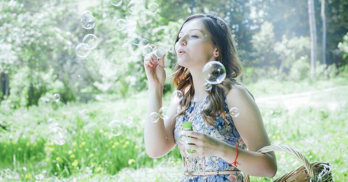
CSSでシャボン玉を描くサンプル
タイトルの通りです。それではいきます。
基本のHTML
<div class="soap_wrap">
	<div class="soap"></div>
</div>
親の「.soap_wrap」にrelative
子の「.soap」にabsoluteを指定してアニメーションさせます。
サンプル
スタンダード
アニメーション一切無し。
.soap_wrap {
	position: relative;
	height: 260px; /*お好みで*/
}
.soap {
	position: absolute;
	left: calc(50% - 100px); /*お好みで*/
	top: calc(50% - 100px); /*お好みで*/
	width: 200px; /*お好みで*/
	height: 200px; /*お好みで*/
	border-radius: 50% 46% 48% 44%;
	overflow: hidden;
	background: radial-gradient(at 46% 54%, transparent 50%, rgba(2, 172, 253,0.3) 70%, transparent 100%) 50% 50% no-repeat;
	z-index: 1; /*Safariでborder-radiusとanimationを併用するとoverflow: hidden;が効かなくなるバグの対処*/
}
.soap::before{
	content: "";
	position: absolute;
	right: -10%;
	bottom: -10%;
	width: 60%;
	height: 60%;
	border-radius: 60% 0;
	background: radial-gradient(at 0 0, rgba(0, 130, 255, 0.3) 40%, rgba(255, 154, 204, 0.7) 50%);
	filter: blur(15px);
}
.soap::after{
	content: "";
	position: absolute;
	left: -10%;
	top: -10%;
	width: 60%;
	height: 60%;
	border-radius: 20% 0;
	background: radial-gradient(at 100% 100%, rgba(255, 255, 100, 0.5) 40%, rgba(120, 255, 140, 0.7) 60%);
	filter: blur(15px);
}
ツヤツヤ
光沢部分に回転を追加して、ツヤツヤした感じに。
.soap_wrap {
	position: relative;
	height: 260px; /*お好みで*/
}
.soap {
	position: absolute;
	left: calc(50% - 100px); /*お好みで*/
	top: calc(50% - 100px); /*お好みで*/
	width: 200px; /*お好みで*/
	height: 200px; /*お好みで*/
	border-radius: 50% 46% 48% 44%;
	overflow: hidden;
	background: radial-gradient(at 46% 54%, transparent 50%, rgba(2, 172, 253,0.3) 70%, transparent 100%) 50% 50% no-repeat;
	z-index: 1;
}
.soap::before{
	content: "";
	position: absolute;
	right: -10%;
	bottom: -10%;
	width: 60%;
	height: 60%;
	border-radius: 60% 0;
	background: radial-gradient(at 0 0, rgba(0, 130, 255, 0.3) 40%, rgba(255, 154, 204, 0.7) 50%);
	transform-origin: 0 0;
	animation: soap_rotate 15s 0s ease-in-out infinite;
	filter: blur(15px);
}
.soap::after{
	content: "";
	position: absolute;
	left: -10%;
	top: -10%;
	width: 60%;
	height: 60%;
	border-radius: 20% 0;
	background: radial-gradient(at 100% 100%, rgba(255, 255, 100, 0.5) 40%, rgba(120, 255, 140, 0.7) 60%);
	transform-origin: 100% 100%;
	animation: soap_rotate 6s 0s ease-in-out infinite;
	filter: blur(15px);
}

/*ツヤ感アニメーション*/
@keyframes soap_rotate{
	0%{transform: rotate(0);}
	50%{transform: rotate(160deg);}
}
ツヤ感・上下に移動
さらに上下に移動させるアニメーションを追加。
.soap_wrap {
	position: relative;
	height: 260px; /*お好みで*/
}
.soap {
	position: absolute;
	left: calc(50% - 100px); /*お好みで*/
	top: calc(50% - 100px); /*お好みで*/
	width: 200px; /*お好みで*/
	height: 200px; /*お好みで*/
	border-radius: 50% 46% 48% 44%;
	overflow: hidden;
	background: radial-gradient(at 46% 54%, transparent 50%, rgba(2, 172, 253,0.3) 70%, transparent 100%) 50% 50% no-repeat;
	animation: soap 10s 0s ease-in-out infinite;
	z-index: 1;
}
.soap::before{
	content: "";
	position: absolute;
	right: -10%;
	bottom: -10%;
	width: 60%;
	height: 60%;
	border-radius: 60% 0;
	background: radial-gradient(at 0 0, rgba(0, 130, 255, 0.3) 40%, rgba(255, 154, 204, 0.7) 50%);
	transform-origin: 0 0;
	animation: soap_rotate 15s 0s ease-in-out infinite;
	filter: blur(15px);
}
.soap::after{
	content: "";
	position: absolute;
	left: -10%;
	top: -10%;
	width: 60%;
	height: 60%;
	border-radius: 20% 0;
	background: radial-gradient(at 100% 100%, rgba(255, 255, 100, 0.5) 40%, rgba(120, 255, 140, 0.7) 60%);
	transform-origin: 100% 100%;
	animation: soap_rotate 6s 0s ease-in-out infinite;
	filter: blur(15px);
}

@keyframes soap_rotate{
	0%{transform: rotate(0);}
	50%{transform: rotate(160deg);}
}

/*上下に移動 お好みで*/
@keyframes soap{
	0%{transform: translateY(0);}
	50%{transform: translateY(30px);}
}
参考になれば幸いです。