CSSでスーパー楕円っぽく切り抜く方法
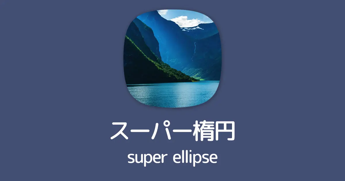
最近のデザイントレンド「スーパー楕円」
CSSの「border-radius」とは少し違います。
ちょっと強引な方法ではありますが、CSSでスーパー楕円っぽく切り抜く方法を提案します。
目次
方針
①まずは要素を5つ並べます。
この時点で「汚いよ」って方は、後述する 疑似要素を使った方法を参照してください。
<div class="ellipse">
	<img src="img/img.webp" class="top">
	<img src="img/img.webp" class="right">
	<img src="img/img.webp" class="bottom">
	<img src="img/img.webp" class="left">
	<img src="img/img.webp" class="center">
</div>
②画像5枚をabsoluteで重ねます。
5枚重なってます。

 /* 箱 */
.ellipse {
	position: relative;
	width: 300px;
	height: 300px;
}

/* absoluteで5枚重ねる */
.ellipse img {
	position: absolute;
	top: 0;
	left: 0;
	width: 100%;
	height: 100%;
}
③「clip-path」を使い、上下左右を作ります。
clip-pathの楕円「ellipse」を使い .top .right .bottom .left の要素を、こんな感じで配置します。
画像は若干透かしてます。
.ellipse .top {
	clip-path: ellipse(42% 14% at 50% 14%); /*上*/
}
.ellipse .right {
	clip-path: ellipse(14% 42% at 86% 50%); /*右*/
}
.ellipse .bottom {
	clip-path: ellipse(42% 14% at 50% 86%); /*下*/
}
.ellipse .left {
	clip-path: ellipse(14% 42% at 14% 50%); /*左*/
}
④中央に画像を重ねて配置します。
中央の画像もclip-pathで四角く切り取ります。
.ellipse .center {
	clip-path: inset(var(--round)); /* 中央の画像 */
}
はい、どうでしょう? スーパー楕円っぽくないですか?
CSS変数を使ってまとめる
先程のCSSコードは、なんかごちゃごちゃしてますので
これを、CSS変数を使って調整し易くまとめると、こうです。
.ellipse {
	position: relative;
	width: 300px;
	height: 300px;

	--angle: 8%; /* 大きくするほど丸っぽく */
	--round: 14%; /* --angleに合わせ、適宜調整 */

	/* これ以降は特に変更の必要なし */
	--anglecalc: calc(50% - var(--angle));
	--roundcalc: calc(100% - var(--round));
}

.ellipse img {
	position: absolute;
	top: 0;
	left: 0;
	width: 100%;
	height: 100%;
}

.ellipse .top {
	clip-path: ellipse(var(--anglecalc) var(--round) at 50% var(--round));
}
.ellipse .right {
	clip-path: ellipse(var(--round) var(--anglecalc) at var(--roundcalc) 50%);
}
.ellipse .bottom {
	clip-path: ellipse(var(--anglecalc) var(--round) at 50% var(--roundcalc));
}
.ellipse .left {
	clip-path: ellipse(var(--round) var(--anglecalc) at var(--round) 50%);
}
.ellipse .center {
	clip-path: inset(var(--round));
}「--angle」の値を大きくするほど丸っぽく
それに合わせ「--round」の値を調整していきます。
サンプル
サンプルを色々紹介していきます。
基本のHTML
<div class="ellipse">
	<img src="img/img.webp" class="top">
	<img src="img/img.webp" class="right">
	<img src="img/img.webp" class="bottom">
	<img src="img/img.webp" class="left">
	<img src="img/img.webp" class="center">
</div>
基本のCSS
以降「--angle」と「--round」の値を紹介していきます。
.ellipse {
	position: relative;
	width: 300px;
	height: 300px;

	--angle: 8%; /* 大きくするほど丸っぽく */
	--round: 14%; /* --angleに合わせ、適宜調整 */

	/* これ以降は特に変更の必要なし */
	--anglecalc: calc(50% - var(--angle));
	--roundcalc: calc(100% - var(--round));
}

.ellipse img {
	position: absolute;
	top: 0;
	left: 0;
	width: 100%;
	height: 100%;
}

.ellipse .top {
	clip-path: ellipse(var(--anglecalc) var(--round) at 50% var(--round));
}
.ellipse .right {
	clip-path: ellipse(var(--round) var(--anglecalc) at var(--roundcalc) 50%);
}
.ellipse .bottom {
	clip-path: ellipse(var(--anglecalc) var(--round) at 50% var(--roundcalc));
}
.ellipse .left {
	clip-path: ellipse(var(--round) var(--anglecalc) at var(--round) 50%);
}
.ellipse .center {
	clip-path: inset(var(--round));
}
鋭め
--angle: 6%;
--round: 7%;
丸め
--angle: 8%;
--round: 22%;
長方形
長方形でも同じ感じでいけます。
.ellipse {
	height: 200px;

	--angle: 8%;
	--round: 10%;
}
疑似要素を使った例
HTMLで同じ画像を5回も並べるなんて汚い!という方はこちら。
HTML
<div class="ellipse shape5"><span><img src="img/img.webp"></span></div>CSS
.ellipse {
	position: relative;
	width: 300px;
	height: 300px;

	--angle: 8%;
	--round: 14%;

	--anglecalc: calc(50% - var(--angle));
	--roundcalc: calc(100% - var(--round));
}

.ellipse img,
.ellipse::before,
.ellipse::after,
.ellipse span::before,
.ellipse span::after {
	position: absolute;
	top: 0;
	left: 0;
	width: 100%;
	height: 100%;
}

.ellipse.shape5::before,
.ellipse.shape5::after,
.ellipse.shape5 span::before,
.ellipse.shape5 span::after {
	content: "";
	background: url(img/img.webp) 50% 50% / contain no-repeat;
}

.ellipse::before {
	clip-path: ellipse(var(--anglecalc) var(--round) at 50% var(--round));
}
.ellipse::after {
	clip-path: ellipse(var(--round) var(--anglecalc) at var(--roundcalc) 50%);
}
.ellipse span::before {
	clip-path: ellipse(var(--anglecalc) var(--round) at 50% var(--roundcalc));
}
.ellipse span::after {
	clip-path: ellipse(var(--round) var(--anglecalc) at var(--round) 50%);
}
.ellipse img {
	clip-path: inset(var(--round));
}
以上、CSSでスーパー楕円を描く方法でした。
参考になれば幸いです。